Queue Signage That Works: Numbered, Digital, and Directional Displays Compared
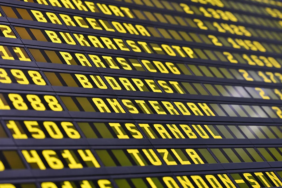
Watch any queue with no signage for five minutes and you will see the problem unfold. People hover, drift a few steps forward, and ask the stranger beside them, "Are you in line?" The order in everyone's head rarely matches the order at the counter. Good signage fixes this quietly, without a staff member repeating themselves all day. It answers three questions — where do I stand, when is it my turn, and where do I go next — and the three common formats, numbered, digital, and directional, answer them in different ways. They are not interchangeable. Choose the wrong one and you add noise to a space that was already confusing.
Start With the Job the Sign Has to Do
Before comparing formats, describe the queue in one sentence. "One line of people waiting for six counters" is a different problem from "customers arriving at random for two different services," and both differ from "a long hall where people keep forming a second line by mistake."
Then ask three questions.
- What decision does the sign make for the customer? If they need to know where to stand, you need directional signage. If they need to know when their turn has arrived, you need numbered or digital.
- How often does the answer change? A fixed rule such as "Take a ticket" can be printed once. Wait times, open counters, and service notices shift by the hour, so they belong on a screen.
- Where will people be standing when they need it? A sign that works from the doorway may fail at the back of a twelve-metre line. Height, sightlines, and lighting decide as much as wording does.
Numbered Displays: Turn-Taking Made Visible
Numbered systems give the queue a memory. A ticket dispenser, a counter display reading "Now serving A-142," or a simple board listing the next three numbers all do the same job: they make the order public, so nobody has to enforce it. That is why they suit places where arrival order matters more than physical position — service counters, delis, pharmacies, repair desks, and waiting rooms with limited standing space.
A few details separate a numbered system that works from one that creates arguments.
- Show the current number where people actually sit or stand, not only at the counter itself.
- Keep the last three or four called numbers visible so people can track progress and see that someone was skipped.
- Use letter prefixes when you run two or three service categories — "A" for general, "B" for appointments. It removes the guesswork about which queue someone belongs in.
- Publish the rule for a missed number. "If your number is called twice and you do not respond, please take a new ticket" is clear; leaving it unstated invites an argument at the desk.
Numbered signage is a poor fit in very short queues, where taking a ticket feels like extra steps, or in settings where service times vary so widely that the numbers stop predicting anything.
Digital Displays: Flexible, But Only as Good as the Data
Digital signage earns its place when the message changes. Wait times, the next open counter, "Cashier 3 closed for break," and multilingual notices can all be updated in seconds without reprinting anything. In large venues — airports, clinics, service centres — a screen showing which counters are live saves people from walking the length of a hall just to ask.
The trade-off is trust. A screen promising an eight-minute wait when the real wait is closer to thirty does more damage than no screen at all, because customers plan around it. If you cannot keep an estimate honest, show something you can maintain: the number of people ahead, or the last called ticket.
Making screens readable and reliable
Match text size to viewing distance; a common rule of thumb in signage is roughly 2.5 centimetres of letter height for every three metres of viewing distance. Check the screen at the brightest and dimmest hours of the day, since glare defeats more digital displays than faulty hardware does. And plan for the day the network drops: a printed fallback or a small manual board keeps the queue moving.
Directional Signage: The Quiet Workhorse
Directional signs carry no numbers and no live data, yet they prevent more confusion than either of the other formats. Their job is to stop the second, unofficial queue from forming. Place them at the point where a person has to decide something, not at the destination. Arrows on the floor or along a low rail, "Queue this side," "Wait here to be seated," and "Pay at counter 4" all do the same work.
Repeat the cue after every corner and every entrance, because people who have just walked through a door are hunting for the next step, not reading a full panel. Pair floor markings with something at eye level: decals fade, get covered by trolleys and suitcases, and are easy to miss for someone with low vision.
Choosing Between the Three
Most queues need one primary format and one supporting sign, not all three competing for attention.
- Choose numbered if order of arrival is the fairest rule and people can wait away from the counter.
- Choose digital if the information changes during the day and someone can keep it accurate.
- Choose directional if the main risk is people standing in the wrong place or forming a phantom second line.
- Combine them when you have both a spatial problem and a turn-taking problem: directional signs to guide people into the line, numbered or digital displays to tell them when it is their turn.
Keeping the Set From Turning Into Clutter
Every sign competes with the one beside it. Give each zone a single primary message, and drop secondary detail lower and smaller. Use the same words throughout — do not call it "the queue" on one panel and "the line" on another, especially if you serve customers in more than one language. Brand colours often fail as sign colours; pale grey on beige can look elegant in a design mock-up and vanish under fluorescent light. Save your strongest contrast for the messages that affect where people stand and when they move.
Audit temporary signs weekly. A handwritten "Back in 5" taped over a permanent panel teaches customers that the printed signage is not worth trusting.
Before You Print, Test It in the Real Room
Stand where a customer stands, at the busiest time of day, and read your own signs. Then check them from the back of the line, from a seated position, and from the doorway. Ask whether a first-time visitor could follow the queue without asking a single question. Confirm that staff give the same instructions the signs do. Then leave everything alone for two weeks and watch where people hesitate. Those hesitation points tell you exactly which sign to rewrite first.
Photo: ArminEP / Pixabay